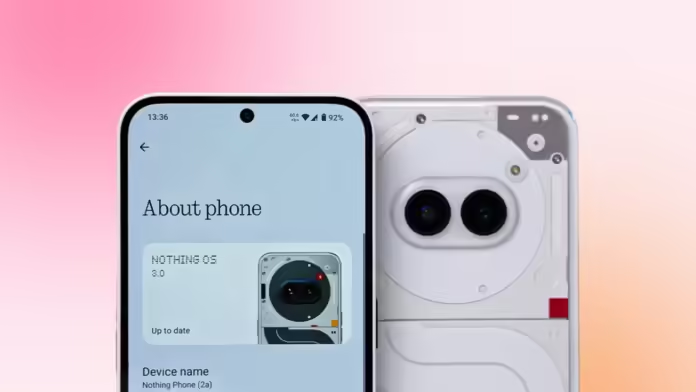
Nothing OS 3.0, based on Android 15, is about to drop. I’ve spent over a day playing around with the beta version on the Nothing Phone (2a), and it’s packed with major changes. So here are the cool new features that you can look forward to.
A totally Revamped Quick Settings:

Nothing OS 3.0 has given this a major facelift. Gone are the chunky pill-shaped toggles. Now, we’re looking at circular, dynamic toggles that not only look cleaner but are also resizable. Want to see more info? Just expand them.
For instance, expanding the Bluetooth toggle now shows you both connected and saved devices. You can also fit up to 16 toggles on one page, which is double what it used to be. No more flipping through multiple screens. Oh, and there’s finally a dedicated data toggle—you won’t need to dive into the Wi-Fi menu just to turn it off. Small win, but one I’ve been waiting for.
And let’s talk about the brightness slider. It’s now thicker, sitting at the bottom of the quick settings for easy access. It even includes an auto-brightness toggle—a community-requested feature. My only gripe? The brightness slider is still MIA when quick settings are collapsed and it’s my request, Nothing, to fix that in the next update!
Smarter App Drawer but Not Yet !

Nothing OS 3.0’s home screen launcher comes with a new “smart” app drawer. Sounds fancy, right? Basically, it automatically groups your apps into folders based on their functions, similar to Apple’s App Library in iOS. So far, it’s not bad, but customization is lacking.
You can’t create your own folders or move apps between them. For some reason, my two email apps ended up in different categories. But since the smart app drawer is still in “Beta,” I’m hoping they’ll add more flexibility soon.

One thing I do love, though, is the **app pinning feature**. You can pin frequently used apps at the top of the drawer, eliminating any guesswork. It’s such a smart little tweak that I’m surprised no other brands have thought of it yet.
Lock Screen Customization: Finally, More Freedom
Customization isn’t just limited to the UI – the lock screen’s getting some love, too. Nothing OS 3.0 lets you long-press the lock screen to edit it, so you don’t have to dig through settings anymore. They’ve also added **five new clock faces** with different fonts and designs. Sadly, there’s still only one analog option, but hopefully, more will follow.

The lock screen widget area is now resizable, meaning you can cram in more widgets if you want to get all your info at a glance. This is perfect for those of us who like to maximize every inch of space on the lock screen. Plus, you can now tweak the left and right toggles directly from there. Super convenient.
Redesigned Settings App

The Settings app got a much-needed refresh, too. Everything is neatly segmented, making it much easier on the eyes and quicker to navigate. If you’ve been using Android since the Nougat days, this layout will feel familiar.
They’ve also thrown in a “Special features” tab, housing goodies like RAM Booster, Game Mode, Pop-Up View, and Experimental features. These changes are smart and practical, showing that the Nothing OS team is thinking beyond just aesthetics.
RIP N-Dot Font

The infamous iconic N-dot font is no longer the default. From the setup screen to the settings page, it’s been replaced by a sleeker, more readable sans-serif font. As a user, I’ll admit it’s a little weird at first. The new font is easier to read and flows better with the rest of the UI. Plus, Nothing isn’t totally ditching the dot-matrix vibe. They’re incorporating it in more creative ways, like in the new Interactive Dot Matrix animations seen in things like the fingerprint unlock and the updated weather app (though I didn’t get to try that in this beta build.
Other Tweaks and Notable Additions

Beyond the big updates, Nothing OS 3.0 throws in a few smaller, but still welcome, improvements. The widgets page is now split into two—one section for Nothing-exclusive widgets and another for third-party apps. I’m also excited about upcoming features like the hourglass widget and widget sharing, even though they weren’t in the beta build I tested.
The Always-on Display is now dimmer, which helps save battery and is easier on the eyes at night. And Nothing OS 3.0 is bringing in Android 15 features like partial screen recording, so you can choose to record just one app instead of your entire screen.
They’ve also added app archiving, letting you offload apps without losing data, much like the app offloading feature in iOS. Sadly, Private Space isn’t here yet, but maybe it’ll be in a future update.
Nothing OS 3.0: Is it a Game-Changer?
After spending some solid time with the beta, I’ve got to say that Nothing OS 3.0 feels like a significant step forward. Performance? Smooth. Battery life? Improved. My phone went from 60% to 30% after half a day of heavy app installations and setups, and it didn’t break a sweat.
If you’re familiar with OxygenOS’s journey, you’ll notice parallels. Nothing OS is evolving—moving away from a bare-bones, stock Android look and becoming its own unique beast. And you know what? I’m totally here for it.
For the Nothing enthusiasts out there, this update should get you hyped. It’s clear that the OS is growing up, and these changes are just the beginning. Let us know your thoughts on Nothing OS 3.0 in the comments below. Is it everything you hoped for? Or is there still something missing?


